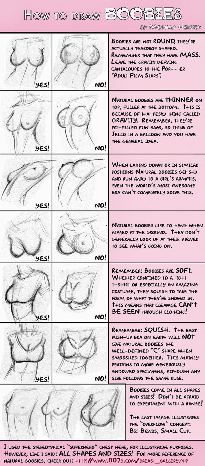
A GREAT writeup at Comic Book Resources on the latest Teen Titans #1 (www.comicbookresources.com/?pa… and the generally poor design of the cover. The writer, Janell Asselin makes a LOT of salient points regarding the lack of a cohesive design. BUT, the greater argument that she makes is for artist Kenneth Rocafort's decision to give Wonder Girl a hugely disproportionate breast size. In the book, she's 16 yet the artist and editors have chosen to endow the character with highly impractical physical attributes. It's a good read all the way around, I highly recommend it.
WHICH led me to something else I've been paying attention to a lot lately, gravity. I've always found it frustrating (AND I'll admit, appealing dangit!) that the human form is so often grossly wrong in comics. Most people fail to recognize it because it's covered up with a lot of gorgeous inks and flashy color, but all to often things like weight, balance and gravity are just plain thrown out the window... along with proportion and good, physically accurate anatomy. In the article, Janell references a terrific tutorial on HOW TO CORRECTLY DRAW BREASTS. I'm not saying all artists need to slavishly render the human form (male and female) like a Leonardo or Michaelangelo, but finding a balance between the ridiculously (let's face it, pornographic in a lot of cases) unrealistic and the true physical form is really what shows that you can draw.
To the point, draw fleshy forms, like breasts in such a way that they look like they belong in the world the character is inhabiting, effected by the same forces to which your character is subjected. The results will not only be more aesthetically pleasing, your decision to pay attention to it will increase the quality of the arts in general. Remember, don't trade eyeballs on your work for good taste or good art.